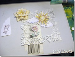
 This photo i was hust playin’ around with an idea. I thought the frame would be a little too fancy for the stamps i was planning on using but nothing else seemed right. The cheery little set is from Our Craft Lounge and is mostly phrases but the sun, clouds and other little items make it so cheery and cute. The frame is a very fancy victorian curlicue frame (victorian_lace_frame_part_1_C20090803144901_19210) from Silhouette that i set to cut at 4 inches square.Then I wanted a little patch of blue to fit behind the frame and be the holder of the other design elements.
 My paper for the background is Basic Grey’s ‘Sugar Rush’ and the blue is from the 6x6 collection but the Yellow is a sheet of 12x12 cut to 5 inches. Because of the scale of paper for 12x12 and 6x6 is half the 6x6 pads usually work out better for card making but i bought a couple of the larger sheets because i love the flower print on the back side. Then a couple of scraps from the ‘Porcelain’ pad to make the hills.
At this point I don’t have the sun and clouds glued down yet so i can glue the frame into place. I put Tombow’s mono multi glue on the 4 inside corners of the frame where it will line up with the patch of blue sky, and let it set a little before laying it onto the blue cause i didn’t want glue smears showing. This way there is no smearing of the glue and positioning is easier. I did this with the flowers also as it dries 3-d and adds just a little bit of dimension
 In order to get the patch of blue to be the right size for the frame (which had been cut for months now); i measured the frame (which is 4 inches at widest point across) and re-opened that file in Robo Master and sized it by getting the right click menu/positions settings and setting the size at 4.00. Then clicked the Rounded Rect. and holding the shift key down drew out a diagonal to size the square at about the size needed.
 You will notice a little green dot in the selected square. This little green dot, if you move it up, will make the radius of the corners wider while pulling it down makes the radius smaller giving you a tighter curve. Pretty neat! The other rounded square to the right with the red line had already been pulled the rounded square down into place on the frame and drug the corners to make it the right size and then set the radius in place. Just showing you the other square so you could see this neat little trick.
 This shows you how i lined up the square and the four inside corners are on the blue sky; about 3 inches square. I deleted the frame, re-positioned the square within the red guidelines which denote the cutting area and cut the square.
The Finished card – well almost, but i couldn’t wait to share…


